Unfriendly Interface Design
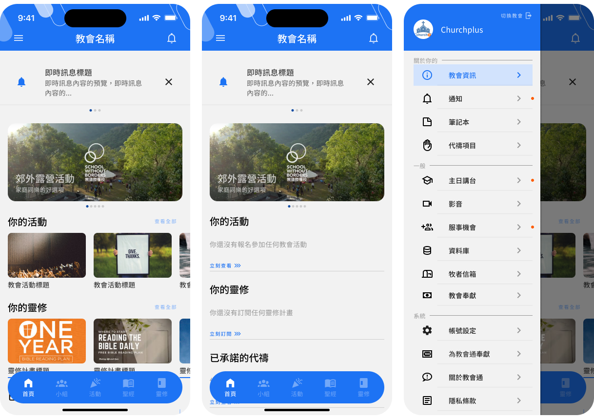
As you can refer to the above screenshots, buttons on the top of the app are coverd by the status bar in the ios phone environment, margins and paddings were super unfriendly and often result in false clicking.
This is an mobile app UIUX design project for the Christian Organization based in Taiwan. Church+ App is currently serving over 50 churches in Taiwan. We together renewed the overall visual and re-organized numberous functions.
30 Jun 2023 - 31 Jan 2024
Chinese Web Ministry Association
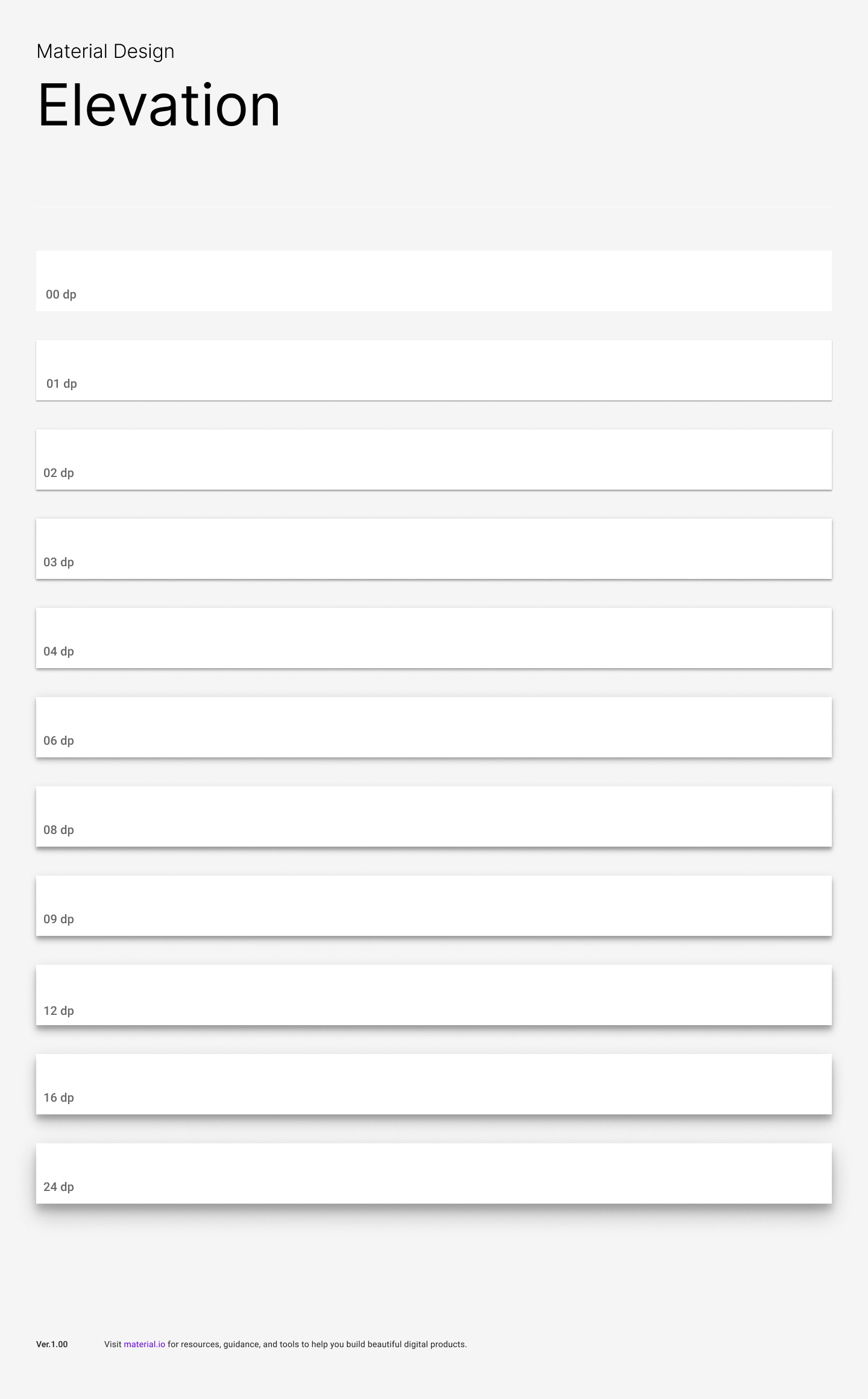
Figma, Figma Prototype
Church+ App have been serving multiple churches for the past few years, they have gained trust because of their wide range of functions and exposion on the religous media. However, they were facing a continuous drop in usage and increasing comments were received. Problems such as "unfriendly interface", "over-complicated functions" and "ineffective navigation within the app" were mentioned.

According to the comments already mentioned by current users, our priority of the project would be creating a user-friendly UI interface in terms of "in-app navigation", "functionailty" and "visual enhancement". This means we have to put extra effort in investigating and discussing the possible solutions for Church+ App before we actually craft the UI.
Church+ App is both available on Android and IOS platform, so it indicates that we should consider the UI difference between Android and IOS devices. Moreover, the app is associated with a complicated back-end server website, we need to update the back-end server website as well so as to keep things easier on both sides.

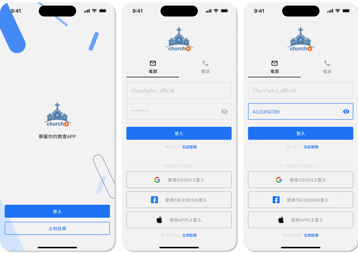
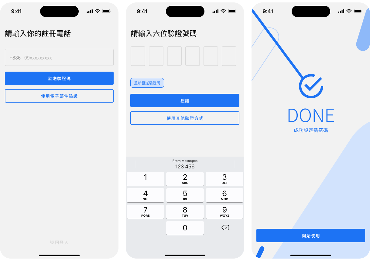
To begin with, we first tried to seek mutual agreement on the overall design styles based on the type of the application, which is interactive, social and religious.
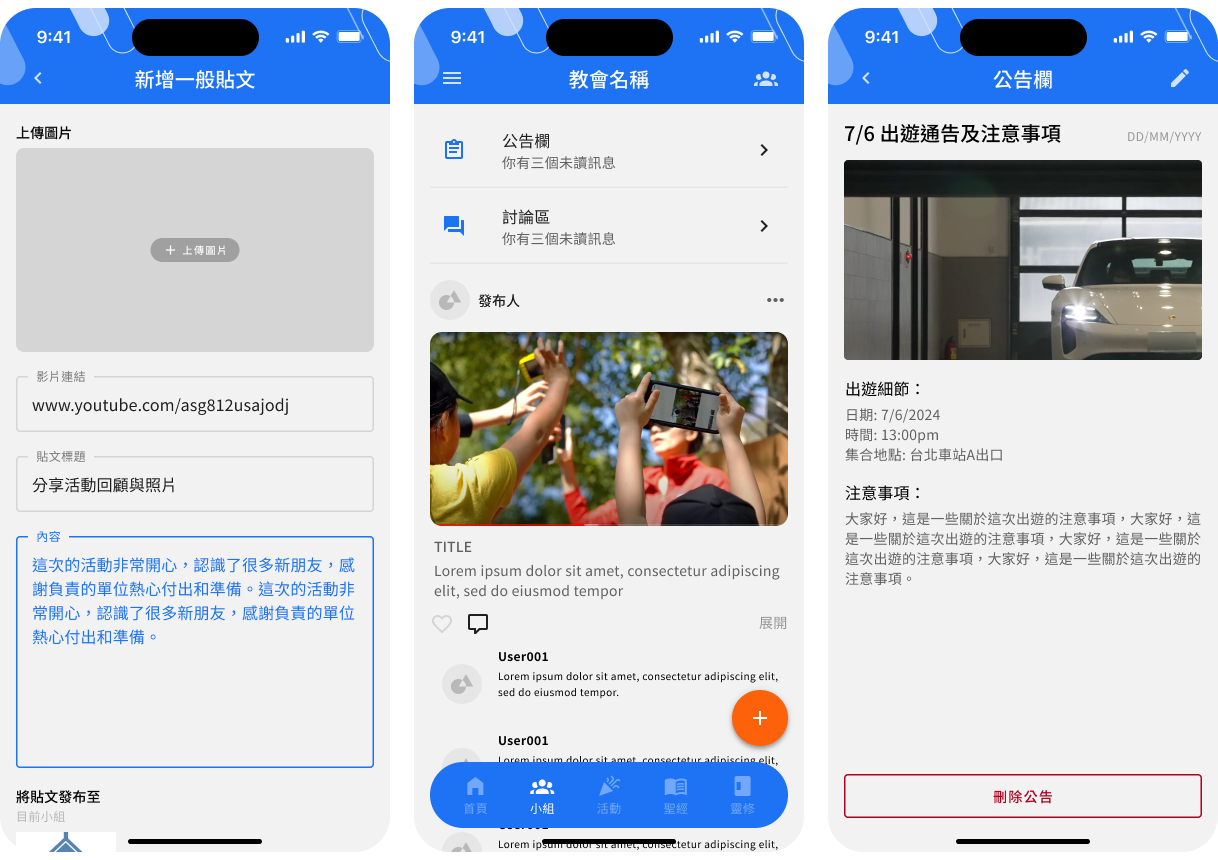
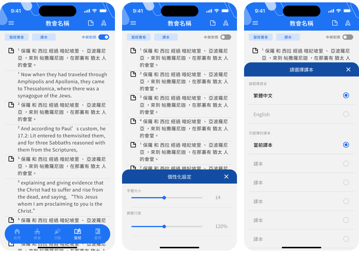
The original app was designed for 9 major functions, as you can see the first photo below. To briefly categorize the existing funcions, it could be divided into "Social", "Reading" and "Events". However, some of the functions are too similar to separate.
For example, the absence of interface distinction between "Sunday Sermon" and "Media Channel", mixing up the "Church Feeds" and "Group Feeds" on the same wall, and not showing the reading plans but a calendar instead on the "Reading Plan" page.
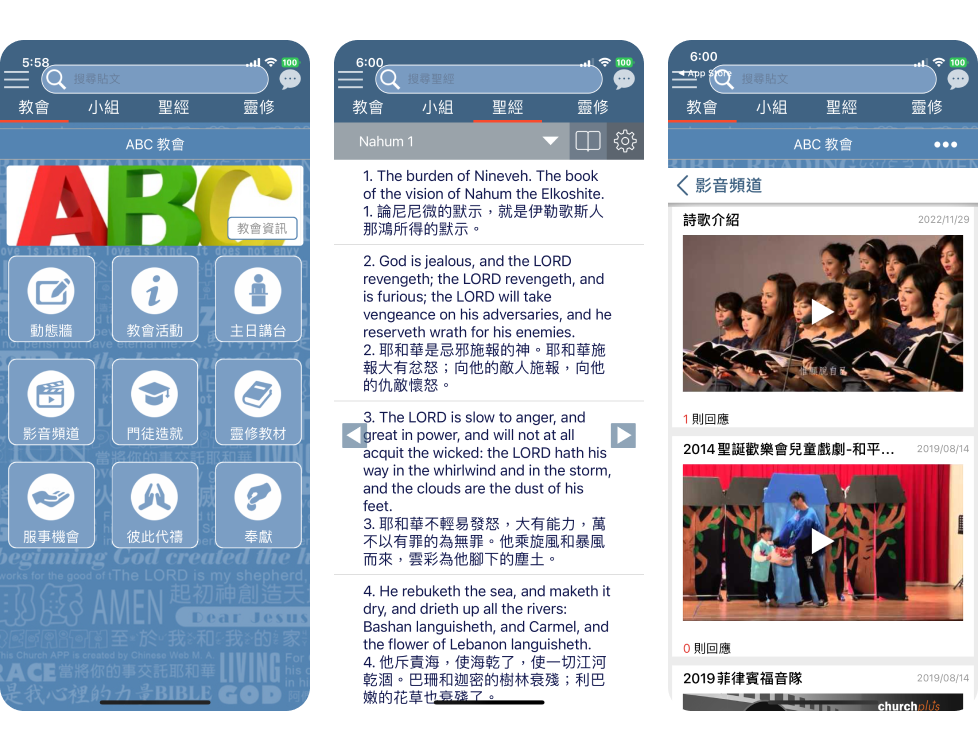
As you can refer to the above screenshots, buttons on the top of the app are coverd by the status bar in the ios phone environment, margins and paddings were super unfriendly and often result in false clicking.
There are comprehensive and wide range of functions in the Churchplus App, but as a new user, I often find it confusing with those function names and how it works.
After my own trial and investigation, we discussed the changes that I would like to make for them so that in terms of "functionality", "naviagtion" and "visual" could be improved. There are too many details to mention, so I picked some to illustrate below.
In terms of functionailty, I tried to combine some of the similar functions so as to lower the user learning difficulty while enable an efficient interface. For example, I rearranged several types of media and gathered them under the same page with category filters, so that users could find everything they want within a page.
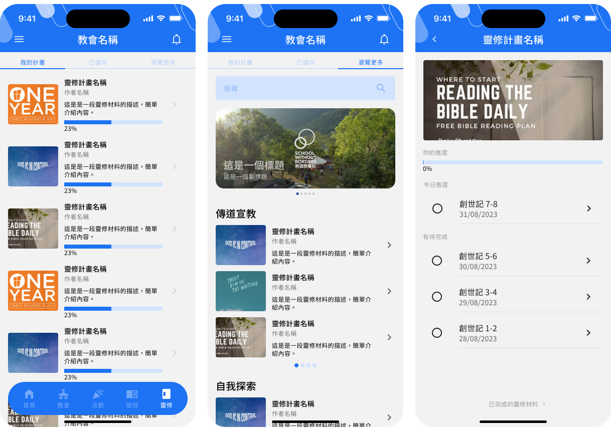
For the reading plan functions, problems were obvious, users can't direct access reading plans and the interface literally didn't support the function itself as it was just a calendar. Therefore, we make a reading plan board to replace the calendar interface so that users could browse all the available reading plans with ease. Moreover, we reserve and adjust the calendar function into a day to day checklist of a reading plan. For plans they've started would also showed up on the app home page, so that people could be better reminded once they entered the app.
In terms of "Navigation", home page was refined with personalized items, together with some adjustments over the categories of functions. Originally there were 9 major functions, in the new version, we made it 5: "home", "feeds", "events", "Bible" and "reading plans". Some minor functions, such as contribution, profile, church information, are only displayed on the side menu. Such changes could help users to concentrate on frequently used functions while keep the interface clean and concise enough to smoothen the user experience.
Also, a floating navigation bar was designed to replace the one on top originally. The margin and padding were improved, together with icons, it is expected that users would feel more convenient and prevent misclicking events effectively.